

Work shoes, Armor - E-commerce web project B2B/B2C
A responsive web design project where the goal was to develop skills in the tools, systems and work methodologies that used to produce web design from an idea sketch, wireframes to a finished mockup based on UX. It also included adapting and changing the design based on insights from several user tests.
Design and production for web from start with idea to finished design template. Applying UX, usability, test-driven/data-driven design and aesthetics, to achieve user-centered design development.
Armor - E-commerce web project with work shoes

The task
This is a school project inkluding a responsive web design project where the goal was to develop skills in the tools, systems and work methodologies that used to produce web design from idea sketch, wireframes to finished mockup based on UX. It also included adapting and changing the design based on insights from user testing.
Design and production for web and online channels from sketch to finished design template. Applying UX, usability, test-driven/data-driven design and aesthetics to achieve user-centered design development.
The project also included:
• User interview
• Empathy map
• User journey
• Design prototype
• Test prototype with users and written insights
• Group presentation
Identified opportunity
Armor - Skyddsskor AB (a fictitious company) sells various types of work and safety shoes to professionals in several segments, e.g. construction work, road work and heavier workplaces but also for healthcare and schools. Private individuals also buy shoes on the website, which means that it needs to be easy to understand which shoes are suitable for different tasks.
User Interview #1
Started by interviewing a carpenter who worked at a major construction company, to find out what she saw as important with work shoes, in choosing shoes, if she uses them, what problems she has when buying, etc.
I introduced myself and made sure the participant agreed with taking notes, audio recording the conversation, all for internal purposes only. The participant was my classmate in this case pretending to be a professional carpenter. Then warmed up by asking if she could tell a little about her background.
Through the interview I had the following insights:
Large selection.
Comfortable.
Quality is most important over the price.
More colors and materials.
Easy to shop online. A smooth and easily purchase process, a fast delivery and secure purchase.
The empathy map
Based on my interview, I tried to find and strengthen the business idea based on the answers.
Think and feel
Hear
Say & do
Pain
Gain
See
Insights #1 - Based on the empathy map and the answers I received in the interview
I want to create a website where the user get help to choose the right shoes for the right type of area/occupation/injury risk.
To create a selection function based on Occupation/workplace (e.g. construction industry, healthcare, school), shoe type/model (low-boots, slippers), type of injury risk (crushing injury, strain injury, etc.), as well as the usual selections that Gender, Size, Color.
I also realized that the range of more personal choices, such as "appearance" could be expanded with more bright colors eg pink safety shoes.
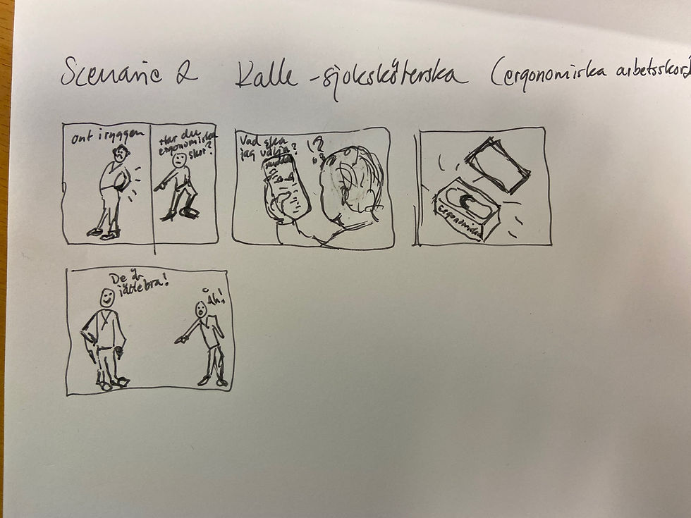
User journey

User story/Scenario #1

User story/Scenario #2
I also made a second user journey scenario about a nursery working at hospital and started to get pain possible beginning of work injuries in his back.
Design prototyping version #1
I set out to simplify for the user by creating a selection function based on: profession, work, injury risk, etc. I have tried to create dropdown lists with different segments to make it easier for the customer to find the right type of shoes.
The selection segments are: Safety/work shoes suitable for different professional roles, types of shoes for different tasks, type of injuries to be prevented, men's or women's shoes, Size, Color.


Selection filters
I placed selection filters with segments or the dropdowns as I call them, in the middle of the first page so that people see them first and use them. They also have a slightly changed icon for that man
should react to them when you move the mouse over them.
Prototyp user test #1
I have tested my website prototype on a person at home. He has had to imagine himself in the situation as a female carpenter and in my persona Madeleine's customer journey, needs and so on. He had some thoughts that contributed to further insights.
Insights #2
The test subject wanted to go directly to the left menu and the heading Safety shoes because that is how he thinks when he needs to find the right products. My insight is that as a seasoned user it works to take shortcuts and you want to be able to find the right product and navigate based on how seasoned and knowledgeable you are.
In this case, the left-hand menu drops out when you click on "Safety shoes" and shows different protection standards (ISO S1, S2, etc.). This is not entirely easy to understand (what ISO S1 means) as the above client or as a private person.
The test person also questioned what it means when he does not use work shoes, which strengthened my thought that my selection function is needed and can actually help the less experienced user to avoid frustration and uncertainty for the right choice of shoes for his particular use.
Safety and security are extremely important in connection with protective equipment, which is why I have added headings that should make the user safer in connection with purchases. Ex. headings in the top menu: "About our safety shoes", "Safety first", "Our customer promise", "Guarantees" and a guarantee stamp, etc.
A/B test
With the help of my class withinn FigJam. The version where I had colored the dropdown bars dark got the most votes. I think it was based on that version feeling calm and maybe the most aesthetic.
The idea is that search or selection surfaces often default to light gray. And in order not to confuse or mistake them for buttons, I have chosen to assume that they are bright just like the search function in the top menu. However, I have put on a Hover-effect that makes the selection areas dark. Likewise, when an active selection is made, I leave them dark. In this way, I want the user to see and use the selection function and also for it to be visible when a choice has been made. The icon and arrow change direction to attract more attention.

Summary prototyp usertest #1
Apart from the above comments, my Figma prototype worked in user test #1 and we encountered no more major quirks in the prototype of the Customer Journey that ends at the first step of the ordering process.
The prototype still lacks several working functions that are not directly related to selection and ordering.


Qualitative measurement method (group user interviews)
I wanted the following feedback:
Question 1: As above, orderer of work shoes - does the setup feel safe and relevant with a selection dropdown with 6 different selection segments?
Question 2: Do you understand how to proceed from the start to an order?
Question 3: Does the site feel professional and does it signal that you as a customer can be confident in buying your work shoes here? (Guarantee stamp, Safety first! Our customer promise, Guarantee, Best in test)
Question 4: Even if the design is unfinished, does it feel right for the target audience?
How did the user test go where I got group feedback?
Answer: The test went surprisingly well. All users made it from the Start page all the way to the Cart.
What worked and what didn't?
Answer: Everything worked in the tests that should work (as far as I solved it in Figma).
What did I learn?
Answer: I received feedback that the start page felt a bit cluttered with all the choices, at first
sight. I need to be even clearer and simplify the home page.
I had also missed details such as marking that a (x1) item is placed in cart in the top menu.
Quantitative measurement methods - KPIs (with defined measuring points)
I got another aspect on measurement segments with a focus on usability and through testing methods with starting point from the UX work.
Survey forms and tests
We were given the task of creating a questionnaire with statements that three people would fill in after they test drove the Figma prototype/Mock-up.
The three people tested my prototype and responded to my statements in the following form:

Test person 1 - Feedback:
I think everything looks great, it already feels like a website, and it has many functions.
The only thing I thought about is that at the start it felt a little messy, a lot of information, that it might be difficult to overview quickly. Alternatively, you could have the selection menu be in a dropdown to start a little cleaner.
Test Person 2 - Feedback:
I think the site feels good and it has all the functions and filters you could possibly need.
I think it might be a bit difficult to quickly find if there is something special you are looking for, when it exists so many filters and features with the same look. Otherwise, I think it feels very good
uniform and the site feels easy to use!
Test Person 3 - Feedback:
Super nice website, I feel safe to navigate around and that the sender knows his products.
Missing shopping cart in the top right corner.
Insights #3 - Results from combined testers' insights, both from this three-person test + the questionnaire, the teacher's feedback, the four people I asked for feedback in the interview, and the first person (at home) who got to test my prototype first, I've made the following adjustments:
I´ve added that the user should be able to share to Social media on the product page (FB).
I have changed the font to a "Slab font" which feels a bit rougher and fits the product better.
I have cleaned the first page from the top bar, the left menu is removed (in web design) and now there are dropdown menus in the top bar of the page.
I have an explanation for what the different security classes ISO S1. S2 and S3 mean.
I have darkened the site slightly to be a little tougher in expression. (however great difficulty in WP).
Added x1 product to cart - top menu (Figma version)
Made the drop-down strips work slightly better than in the first submission, (but still four clicks).
Created a light version of the logo with a company name that strengthens the segment "Armor AB" (Protection)
Added a quote under the logo to make it clearer what "we sell" - Work & safety shoes.
I have reviewed and tried to clarify SEO and thought like a UXwriter with clear CTAs (buttons and headings).
Other testing methods I could have used:
Shadowing - test method of behavior of the user
We also received information about different ways to measure user behavior. By, for example, looking at body language, facial expressions, how the user navigates through the site, how many wrong clicks and how long it takes, etc. You can either record the user as he navigates or sit with him and watch how he does it or ask the user to "think out loud" and tell what he sees, thinks and does, etc.
User testing
We were given the task of writing questions based on how the user solves tasks on our site. We would also write measurement points (how many clicks, how long, how many wrong clicks?) as well as write down the results of each question/test. (A classmate tested as I watched and listened to her thinking aloud).
Task 1
Find safety shoes that are especially suitable for a female carpenter (size 39) who wants to protect herself from stepping on sharp objects or from pinching her toes. The shoes must be pink/purple and low shoes in safety class S1.
Measurement points:
1. How many clicks does it take the user to find the right one (a specific product)? Result: 7 clicks for the user to find the right one (pink safety shoes).
2. How many clicks were unnecessary or wrong?
Result: 0 clicks
3. How long?
Result: 10 seconds

Task 2
Find all safety shoes that have safety class S1.
Measurement points:
4. How many clicks does it take the user to find the right one (a specific product)?
Result: 2 clicks for the user to find all safety shoes with class S1.
5. How many clicks were unnecessary or wrong?
Result: 1 click
6. How long?
Result: 4 seconds

Task 3
Find the type of inner lining (the only pink pair) the shoes have. (from home page)
Measurement points:
7. How many clicks does it take for the user to find the right shoe and see which inner lining the product has?
Result: 8 clicks + 1 scroll for the user to find the information about the inner lining/material of the pink shoes from the start page.
8. How many clicks were unnecessary or wrong?
Result: 0 clicks
9. How long?
Result: 12 seconds

Task 4
How do you put selected shoes in the shopping cart and how do you go to the shopping cart?
Measurement points:
10. How many clicks does it take for the user to add selected shoes to the cart and to get to the cart?
Result: 2 clicks for the user to put the pink shoes in the shopping cart and go to the shopping cart from the home page.
11. How many clicks were unnecessary or wrong?
Result: 0 clicks
12. How long?
Result: 2 seconds

Insights #4 - It's starting to feel more stable now with the user tests. I notice from the fact that there was only one wrong click on all four questions that the logic fits well. That the user does not find it difficult. A lot because I use a type of navigation that is standard. The menus are where they usually are positioned, etc.
I received a comment that the product information should be above the buttons on the product page, but see that the way of putting deeper information under order buttons etc. is accepted on several sites. We also want to make it as easy as possible for the user to be able to order easily and smoothly (read not having to scroll down to order the product). Otherwise, it went very well.
Accessibility – WCAG
WCAG - are rules created to make information on the web more accessible to people with some type of limitation. It can be about physical disabilities, motor difficulties, vision and hearing impairments, people with epilepsy, etc. All municipal websites have high requirements for accessibility and it is important to think and work based on the fact that everyone should be able to use the websites and absorb the information. Therefore, we must strive to make it easy to understand and accessible to everyone.
We talk about three different levels of restrictions:
Permanent – Ex. Blind and deaf people or people in wheelchairs, color blindness, etc.
Temporary – Ex. Injured person, broken arm, ear infection, Lack of language skills, etc.
Situational – Ex. Strong dialect, distracted person eg someone driving a car, bartender (messy environment), new parents (distracting toddlers) etc.

Tool to measure availability
It is important to create digital design and information on the basis that they should work to read, navigate and search for the information on the web. For example, you should be able to navigate through a page without using the mouse pointer. It is also important that the graphic elements are created with code so that the narrator can read them the content. If there are graphic elements that are bitmaps with text, then the text must be entered in the code so that it can be read. This is also good from an SEO search function perspective.
Measure Contrast - Stark (plugin in Figma)
Another important area is how the contrasts are on the site. Both with icons, text and larger graphic elements such as buttons and colored surfaces with text etc. A plugin in Figma – Stark, measures how much contrast two elements have against each other. Both in color and size of text. This was a great feature. A consistent piece of advice is to make it as simple as possible to make it as accessible as possible.

Test of contrast
I tested a so-called "dimmed button" (not active) on the product page. The color of the button was Light gray with white text - it was not approved in the contrast.
Bild Strak kontrast test
After discussing with the teacher how to make a button inactive, I decided to remove the button completely. It felt unnecessary as you can see the number of products in the shopping cart and get to the shopping cart via a small symbol in the top menu instead. I made the other texts in the dropdown lists; "Select color", "Size" and "quantity" in bold text so that they would be approved in the contrast.

Insights #5 - Simplify if possible. The tool/plugin "Stark" is great and I will use it a lot in the future.


Conclusions
We have acquired an incredible amount of information and a whole lot of knowledge in a short time. I feel like I need more time to learn how to build and master CMS systems like Wordpress, and learn html and CSS code and also immerse myself in Figma as a tool. I have previously edited ready-made templates in wordpress but did not understand how difficult it is to lay the foundation or create pages from scratch. I had been looking forward to learning how to create websites in Wordpress and of course learn it, so I will continue to practice. I also found all the qualitative and quantitative methods of testing very good and interesting as well as the information on availability.
Always think from the outside and in, and from the user's perspective. Work iteratively and evidence-based, using methods like design thinking and double diamond makes the result more relevant. There are always several solutions and we want to find the one that is best suited for the user right now. With hypotheses you have a basis to start from which is tested and questioned on an ongoing basis. One solution is not always the answer and finally; test all ideas and adapt continuously. Good enough is a good start but almost never the final result, keep develop through time.
Execution: The task was performed individually
Schedule: 1 and a half week
Deliverables: Written submission containing a detailed brief, concept idea, a design system, wirefram, prototype and mockup design made in Figma, documentation of all used tests and insights, a website made in Wordpress including part built with html/css, a written report and a presentation.
Tools: Figma and Wordpress


